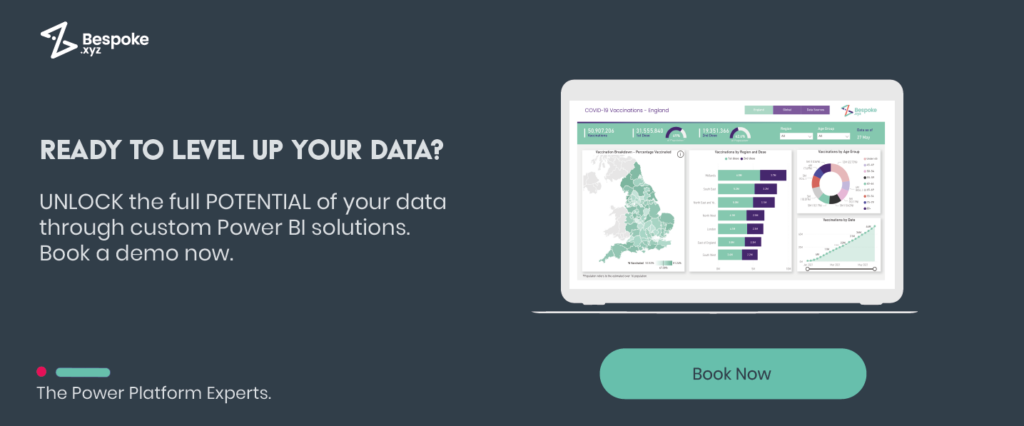
When it comes to “data”, it’s easy for the uninitiated to feel overwhelmed by seemingly mundane numbers, graphs, and comparisons. Without the right tools to decipher the intricate layers of data, it can all appear quite daunting. With Power BI dashboards, though, that’s not the case!
Power BI dashboards reveal the stories buried deep within data. The data could encompass anything – from the latest pop culture phenomena to the nuances of your personal finances.
What is a Power BI Dashboard?
Power BI dashboards are like a one-stop shop for all your business data needs. It’s a fancy screen (aka canvas) that shows you all the important stuff like key performance indicators (KPIs) or operational performance – in real time.
We like to think of Power BI dashboards as magic wands that can remove all the noise and present only the important data. It does this by aggregating, communicating, and displaying the most important data in a single view.
Power BI Dashboards vs Reports: What’s the Difference?
Power BI dashboards and reports are both amazing tools that help visualise data. But, they work differently. Reports are like data detectives that dig deep to reveal insights, while dashboards give you a quick snapshot of the big picture.
Reports give you a ton of information about your data. Meanwhile, dashboards show a summary of the data using graphs, charts, and other visuals. Dashboards are great for people who need to make fast decisions based on the data, and to keep an eye on the most important stuff.
Power BI Dashboard Examples in the Workplace
Financial Reporting
The finance department deals with a ton of numbers, which can be a total headache. But financial reporting dashboards make things a whole lot easier.
You can track common financial stuff like balance sheets, cash flow, and profit & loss statements. And, with YoY comparisons for up to two years, you can easily spot trends and figure out what needs fixing. Plus, you can create dashboards that provide KPIs and working capital ratios, so you can get a full picture of your financial health.
With all of this data on a dashboard, you can make informed decisions much faster. You can quickly see which areas are doing well and which ones need some TLC. And, the visuals make it easy to share financial info with other departments and stakeholders.
Sales Dashboards
In today’s fast-paced business world, you need to know your sales data inside and out. The problem is figuring out what’s working and what’s not. That’s where sales dashboards come in handy.
With these dynamic dashboards, you can get a full picture of your sales performance. You’ll be able to see trends, forecast future sales, and even identify sales opportunities that you may have missed before. It’s all about using factual data to make informed decisions.
Sales dashboard examples:
- Sales Analysis Dashboard: Provides an overview of sales performance to identify areas for improvement
- Sales Performance Dashboard: Tracks the performance of your sales team to identify areas where they need support
- Sales Forecast Dashboard: Predicts future sales performance based on historical data and current trends.
- Lead Analysis: Provides insights into your sales pipeline by tracking leads through the sales process
- Sales Comparison Dashboard: Compares sales performance across different time periods or regions to identify trends and patterns
Marketing Dashboards
In marketing, data is king, but dealing with all that information can be a major challenge. That’s where marketing dashboards come in! They make it super easy to get clear insights and optimise your campaigns for success.
Marketing dashboard examples:
- Website Traffic Dashboard: Keep tabs on what’s happening with your website (e.g. page views, unique visitors, and bounce rate etc.)
- Lead Analysis Dashboard: Determine where your leads come from and how they progress through the funnel
- Social Media Dashboard: See how your social media posts are performing and how you can get more traffic to your site.
- Email Marketing Performance Dashboard: Monitor how your email campaigns are performing and whether people are clicking through to your website.
- MQL Status Dashboard: Track your marketing-qualified leads and see where they are in the sales cycle
Want to see more Power BI dashboard examples? Head over to “5 Power BI Examples to Help You Make Better Business Decisions” to see some real-life examples from our own clients.
6 Fun Power BI Dashboard Examples
The business dashboards are a game-changer in our everyday work life! But we’ve been experimenting with data in some fun and exciting ways. Here are three Power BI dashboard examples, which are created using Microsoft BI solutions, revealing some truly fascinating insights…
- International Women’s Day Dashboard
This dashboard illustrates some key statistics about the change over time in the percentage of females in ICT roles across Europe. We pulled the data from Eurostat, which gives us the number of male and female ICT specialists between 2004-2021.
If you’re curious about how many female techies there are in Europe, this dashboard is for you.
Go ahead, take a peek at it here.
- World Statistics Day Dashboard
Our World Statistics Day Power BI dashboard showcases the Power Platform Google search trends from 2004 until now. We’ve focused on the US, UK, Germany, and Denmark, so you can see how it’s all playing out in those countries.
Power BI has been killing it over the years, but we’ve noticed something interesting. The search terms for Power Automate are on the rise. Could it be the next big thing? Only time will tell.
Anyway, if you want to check out this cool dashboard for yourself, click here.
- World Population Dashboard
You can view all the details about the world’s population, broken down by continent, country, and gender, with our World Population dashboard. You can even see how the population trend changes over time. It’s like a crystal ball for the future!
And if you wanna know more about a specific country, just hover over the map and viola – all the info you need! This dashboard is a prime example of how Power BI can help you get the most out of your data. Don’t believe us?
Check it out for yourself right here!
- Global Emissions Dashboard
The UN has called for serious action on greenhouse gas emissions, so we thought it was time to bring all the scattered data together.
It provides information about the global impact of three major greenhouse gases, which countries have done the most to cut emissions, and which industries are releasing the most gases.
Want to take a closer look for yourself? Check it out here. It’s a bit of an eye-opener!
- May 4th Dashboard
Consider yourself a bit of a movie buff? This dashboard is the ultimate data fest! We know you can never have enough info, especially when it comes to your favourite films. That’s why we’ve created an interactive Power BI dashboard dedicated to the silver screen.
Our May 4th dashboard is jam-packed with all the movie data you could ever want. Want to know which films had the biggest budgets? Done. Curious about the critic’s favourites? Check. Interested in juicy facts about your most-loved characters? We’ve got it. And, we even included info on starships with the biggest hyper-drive and crew. How cool is that?!
So, get ready to geek out and check out our May 4th dashboard. We think you’ll love it!
- Spotify Dashboard
If you’re a music lover, our Spotify dashboard is a great place to find info on all your favourite artists. It gives you the lowdown on the top artists globally, as well as by region. Want to know who’s killing it in Asia or Europe? We’ve got you covered. Plus, you can see how many listeners each artist has in each region.
But that’s not all. We know you’re curious about the artists’ earnings, and we’ve got that info too. You can see exactly how much moolah your fave artists are raking in.
Whatever your level of music fandom, our Spotify dashboard will help you stay up-to-date on the latest music.
Getting Started with Power BI Dashboards
Ready to turn your reports into visually stunning data representations? We’ve got you covered!
Whether you’re just looking to move away from Excel and view your data visually, or you want a full Power Platform Adoption Strategy, Bespoke can help.
Using innovative perspectives, we simplify data to deliver creative solutions tailored to your future goals by challenging the norm. You can learn more by contacting us today and one of our friendly Power BI consultants will assist you in starting your data-driven journey with Power BI dashboards.