Get a callback from our team within 20 minutes during business hours.
Creating eye-catching, informative visual representations of data is very simple yet so many excel users do not know how to create such graphs and charts. This article will go through step by step on how to make a graph in excel and some simple formatting options.
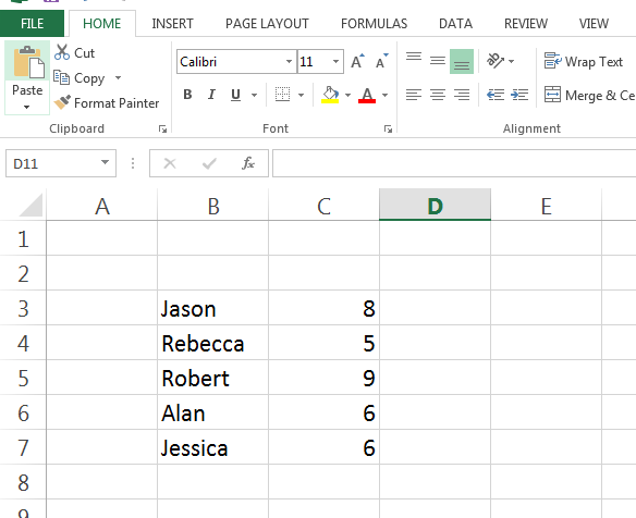
The first stage is to create your series of data. A very simple example of a data series can be seen below, where each person in question has an allocated score.
How to make a graph in excel
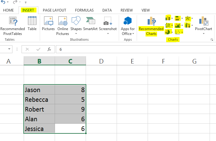
To create a basic chart, highlight the cells required and select the ‘Insert’ tab in the main toolbar. In this toolbar the option to select a chart type is available, as indicated below. Once the graph type has been selected Excel automatically processes the data into a visual representation.
How to make a graph in excel
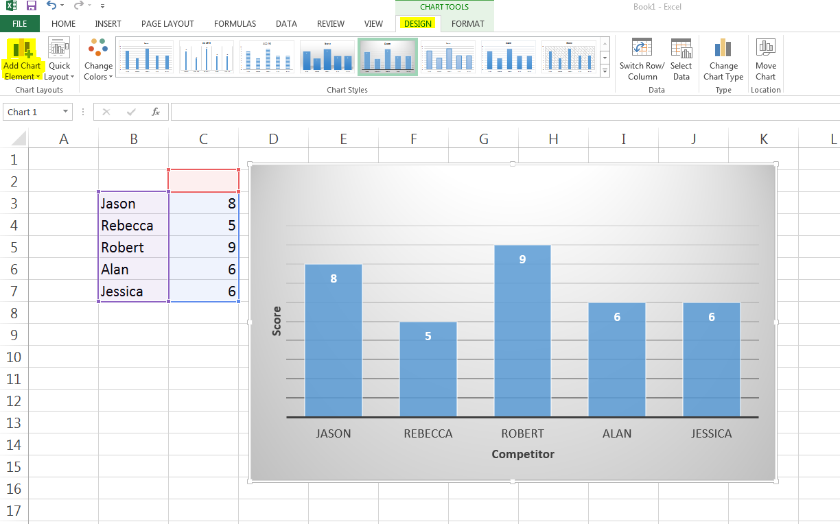
Once you are able to make a graph in excel, the next stage is to format the graph to meet your specific requirements. To begin formatting the chart, click on the ‘Design’ tool option in the main menu and then select the ‘Add Chart Element’ option as shown below. Once this option is selected the range of modifications to the chart are numerous, including adding axis titles, error bars, legends etc.
The best graphs and charts give a clear indication of the data they represent but in a captivating, aesthetically pleasing manner.