Get a callback from our team within 20 minutes during business hours.
Home » Technologies »

Even as seasoned Excel experts, we’re well aware of the limitations that can come with it. Excel, powerful and versatile as it is, can sometimes pose challenges.


Before diving headfirst into the world of Excel alternatives, it’s important to understand your current data management needs and how well Excel is serving them.
Remember, the ultimate goal is to make your data work harder for you, not the other way around. If you’re looking for an Excel specialist who can help you explore the right Excel alternatives, then you’re in the right place.
Wave goodbye to the limitations of large datasets. The Power Platform can handle and analyse massive amounts of data with ease, ensuring smooth and efficient performance at all times.
Uncover how the Power Platform can enhance your business operations and boost efficiency. Explore its potential below.
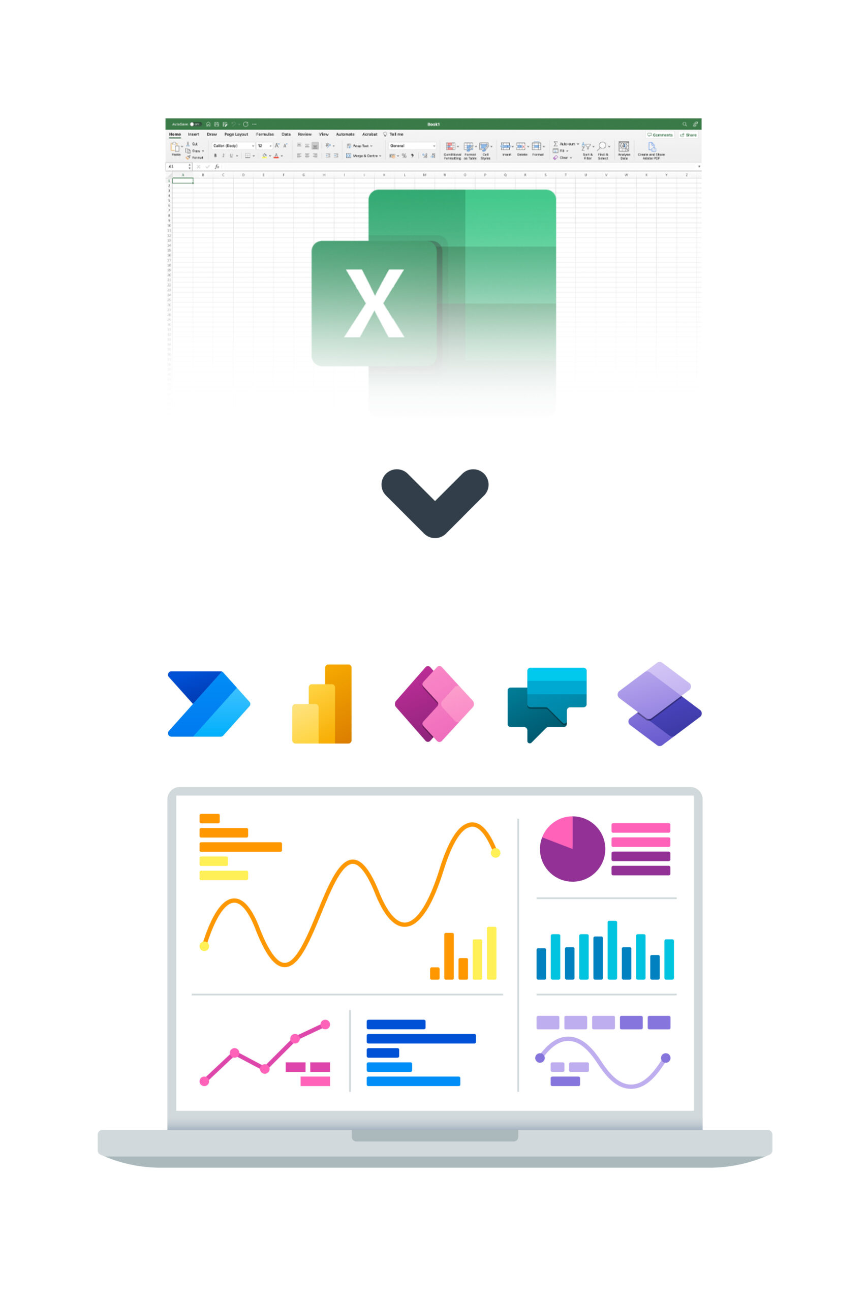
Take a closer look at the vast selection of Excel alternatives and Microsoft technologies that Bespoke specialises in, delivering customised solutions for your specific business needs.
At Bespoke XYZ, we’re not just Excel Experts; we’re your partners in the journey towards digital transformation. Our expertise goes beyond Excel solutions, diving deep into the world of powerful Excel alternatives like Microsoft’s Power Platform. Our team doesn’t just implement new tools; we tailor them to fit your business needs perfectly.
We start by understanding your unique business requirements, challenges & objectives. Enabling us to suggest the best Excel alternatives.
We ensure a smooth transition from Excel to Power Platform, minimising operational disruption & handling data migration and tool setup.
We reject a one-size-fits-all approach, instead crafting Power Platform solutions tailored to your specific business needs.
Switching tools can be daunting, so we provide thorough training and continuous support, guaranteeing your team’s comfort and proficiency with the Power Platform.